Kampung Senang
#WEBSITE DESIGN
Project Brief | To revamp the content-heavy Kampung Senang's corporate website for a mobile responsive, customer-centric, and highly visual site with beautiful imagery. |
What I Did | #User Research #Usability Review #Information Architecture #Card-sorting #Web & Mobile Site Design #Usability Testing #Front-end Development |
Approach | I started with conducting a usability review on the existing website to uncover usability issues to be remedied, as well as conducting focus group discussions with different user personas to discover their needs for the new website. As it is a content-heavy website, I started my focus on information architecture by organizing, structuring, and labeling content, using an usability method called card sorting. The goal is to help users find information and complete tasks easily. Next, I designed the wireframes and hi-fi screens, tested the user flow and implemented the designs in front-end coding before handing over to the internal team for future updates. |
Homepage Design
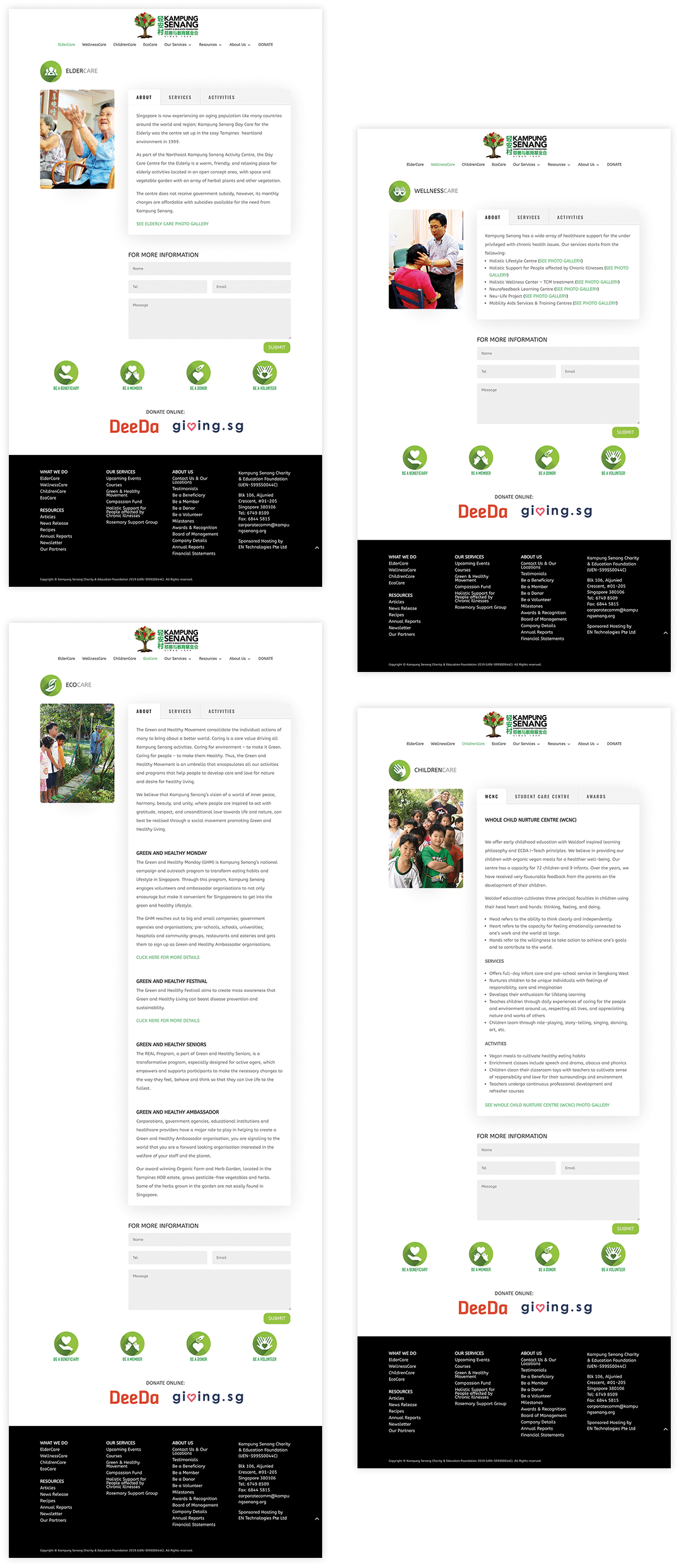
Services Page Design

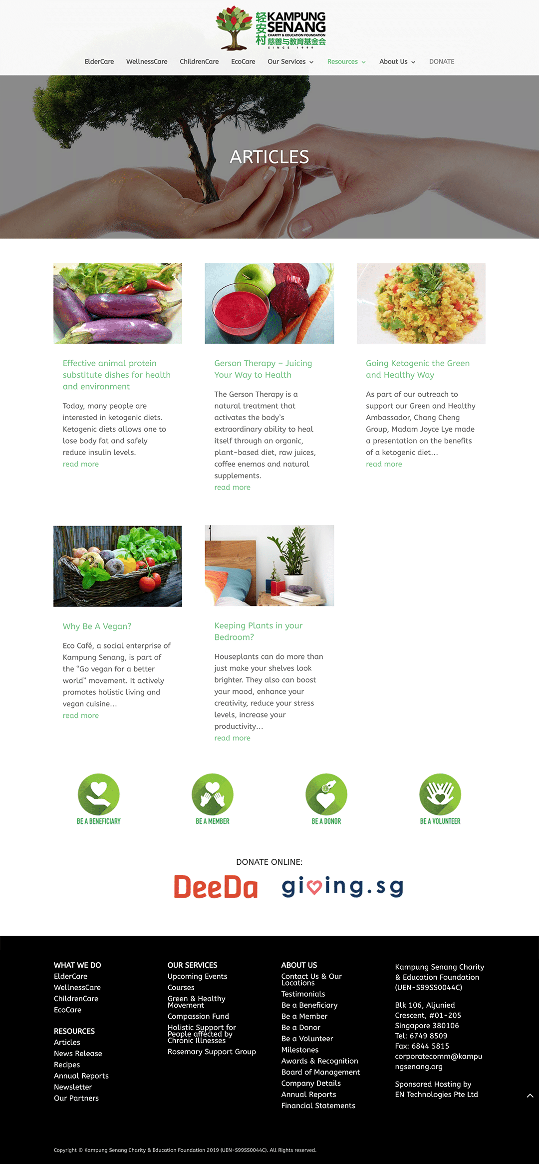
Articles Page Design
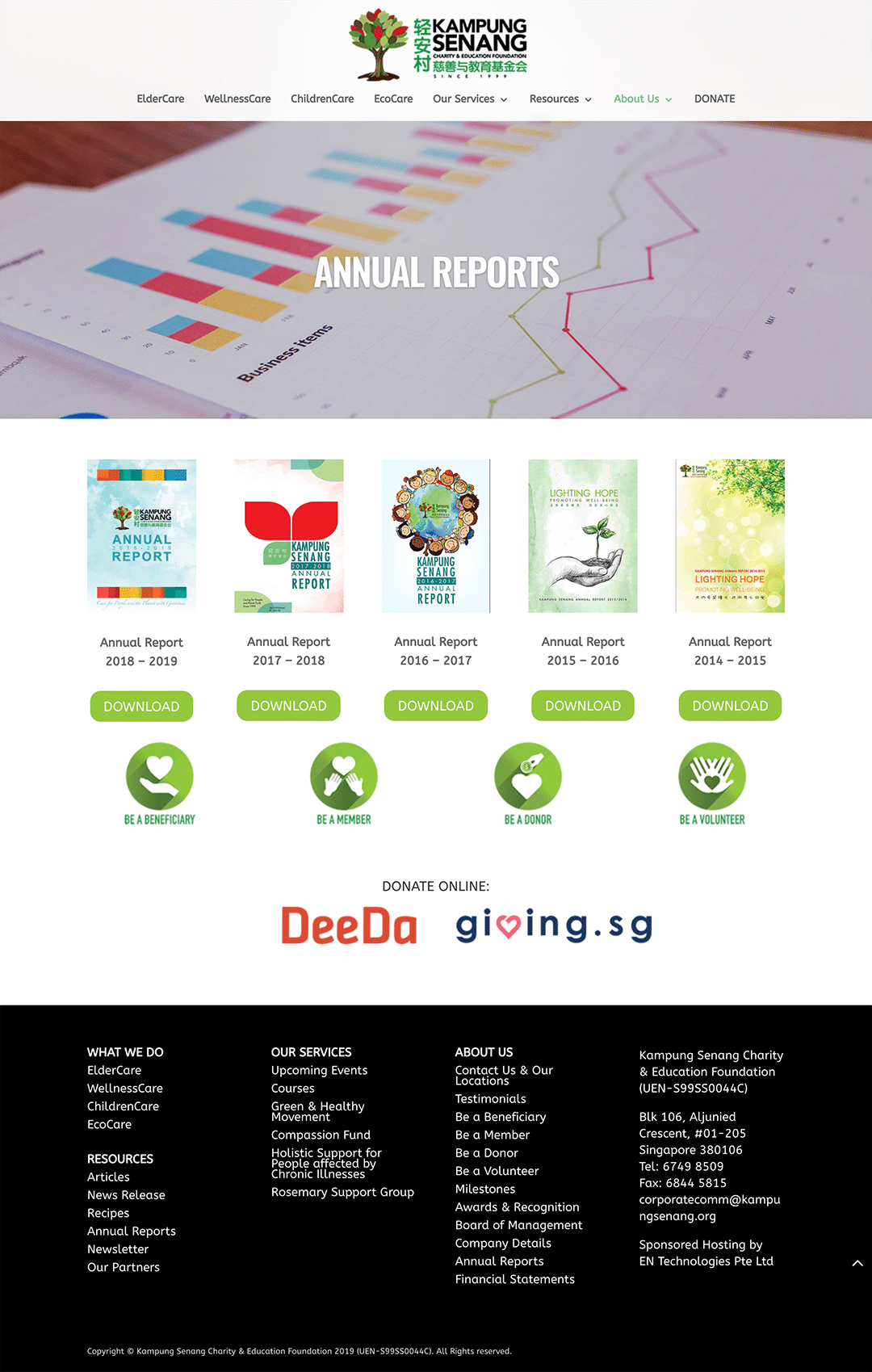
Annual Reports Page Design
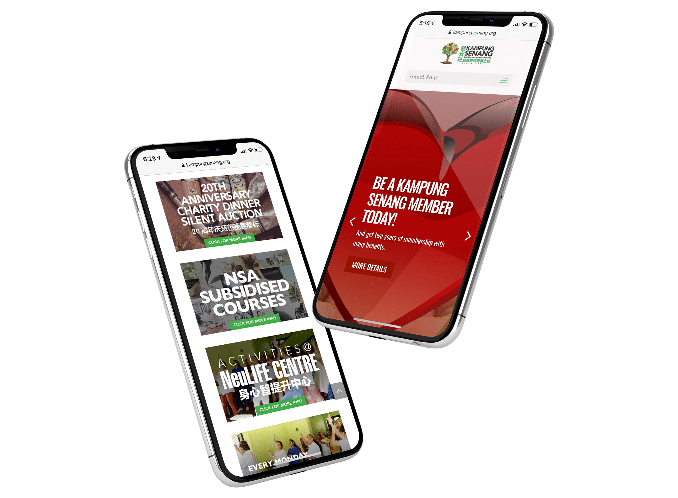
Mobile Pages Design

About Kampung Senang
Kampung Senang, a charitable organisation with Institution of a Public Character (IPC) status, delivers its caring through its children care, student care, and elderly services, its mobility aids services, its holistic and compassionate services, and its educational programmes, to serve all people in Singapore, regardless of cultural or religious background.


